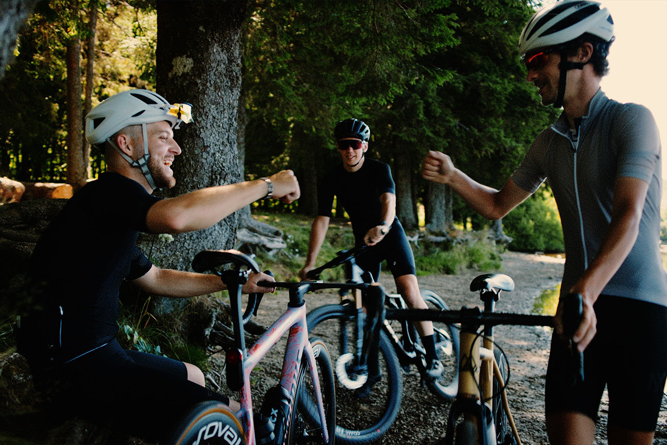
A new adventure for Nova Ride
Today marks a new chapter! We are proud to present our new visual identity, the result of in-depth reflection on our evolution during this year. This more dynamic rebranding is a new direction in line with our strategy and is a natural part of our evolution. We look forward to showing you the new features that come from it, while remaining true to what has made Nova Ride a human-sized and passionate company. This rebranding is a promise: to continue to support you in your adventures and challenges with as much enthusiasm and innovation as ever in the design and production of our components.
New ambitions
New positioning
New identity
Nova Ride is taking a new step in its history with this rebranding. By opting for a more sober and refined visual identity, we affirm our desire to stand out and enter a new era. By focusing on the essential, we want to highlight the quality and performance of our products, rather than overloading our communication.
Symbolizing our desire to evolve and position ourselves as a major player in the high-end components market, this new identity represents Nova Ride's credibility as a high-end components brand.
A NEW ERA

The logo
Our new logo retains the essence of Nova Ride while adopting a more contemporary and minimalist approach, without destabilizing our community. Thanks to the integration of modern typography, combined with simple shapes, it is both recognizable and adaptable to all media, from our products to digital platforms.
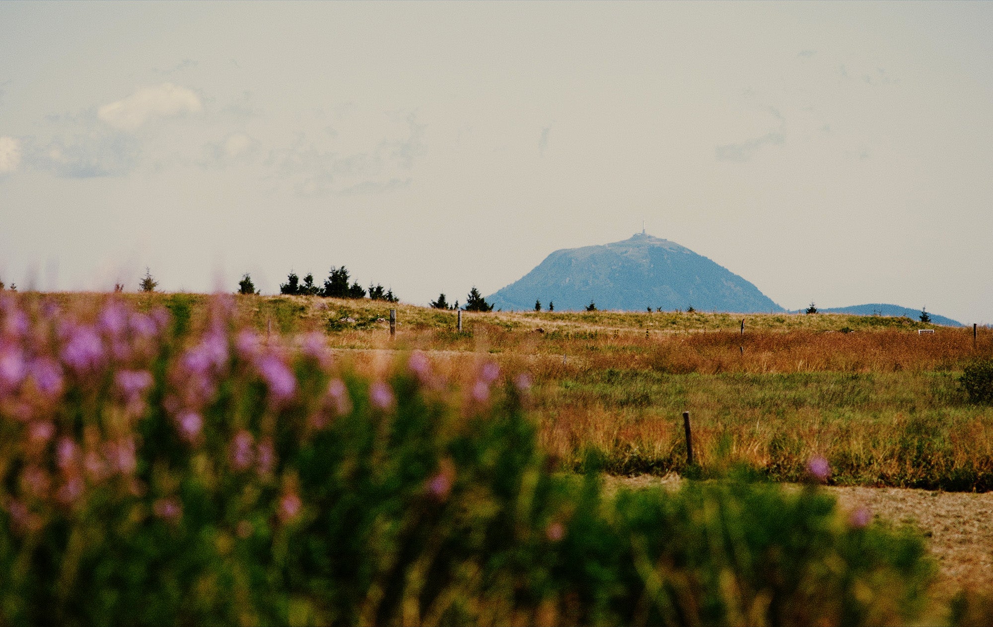
This logo embodies the environment that surrounds Nova Ride. The Auvergne-Rhône-Alpes region, with its varied landscapes and unique reliefs, is a real playground to design and develop our products in ideal conditions.
A redesigned typography
Typography is the voice of the brand. This is why we opted for a return to the roots by giving a second youth to the font used between 2016 and 2019.
We have chosen to tend towards simplicity and minimalism, guaranteeing timeless typography and adaptability to all types of media. The use of a sans-serif (without serif) and italic font brings a real contemporary and speedy aspect.
A new symbol
A new logo often requires a new symbol that reflects this evolution. We have chosen a more refined design with a single shade of color. It allows the company to adapt to current trends and to appear more modern and dynamic.
Our specifications aimed to preserve the essence of the mountain, symbol of our playground, of surpassing oneself and quite simply of the brand image for the last six years. We wanted to subtly integrate an "N" evoking both Nova Ride and the shape of a lace of a mountain pass. The entire composition is designed to convey a feeling of progressive ascent, inviting, like us, users to always aim higher.
The extra detail
The gradual thickening towards the right symbolizes our growing ambition and embodies our desire to surpass ourselves and move forward.
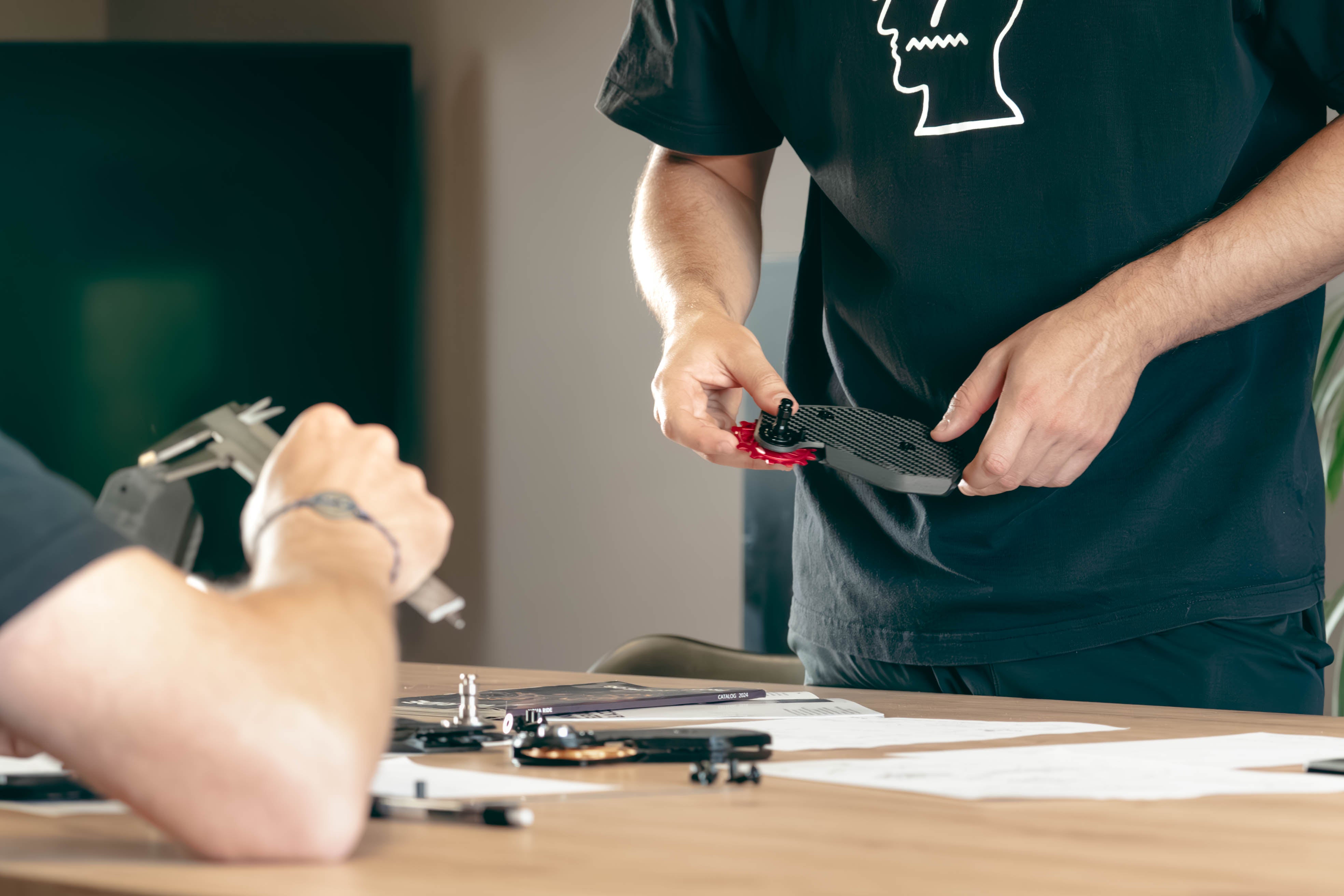
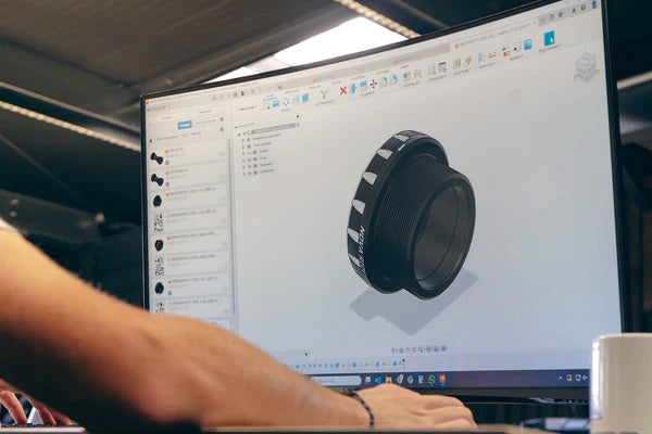
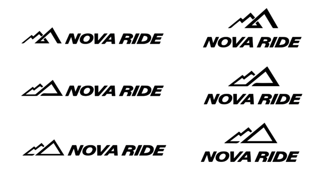
Create, iterate, test
Choosing a logo is a strategic decision that will have a lasting impact on our company's image.
Just as we evaluate the performance and reliability of different components before integrating them into our products, we must analyze the different versions of a logo based on specific criteria: relevance, memorability, adaptability, etc. This selection process allowed us to choose the most effective and versatile version.
Here are the last three proposals that caught our attention:
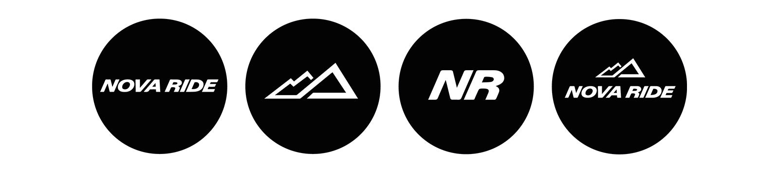
Declined and adapted according to the media
Our logo changes shape to adapt to each environment without losing its identity.
A unified identity for a common future
This rebranding creates a bridge between our two brands, forging a strong and lasting identity that unites our different activities.
Identifiable colors
Our new graphic charter is a renewed visual identity, where the brand's emblematic colors are subtly reinvented and accompany our new typography towards a more assertive and coherent vision.
Blue, our favorite color, remains at the heart of our communication. It symbolizes trust, performance and expertise. By combining it with black and white, we create a sober, elegant and timeless palette, which reflects the essence of our brand.

PANTONE 289c | HEX #0C2340

PANTONE 2145 C | HEX #004EA8

PANTONE 2195 C | HEX #0071CF
An upgrade for a rising brand
Our new brand identity reflects our move upmarket across all of our communication materials, including our packaging. The latter, with a more refined design, better highlight our product features, our new logo and our revisited colors for better readability and an enriched customer experience. This update will be carried out gradually, starting with our online presence and then extending to our various points of sale.
This blog is dedicated to those who believe that small details make a big difference.
Looking forward to see you on the road,
Tom – Head Marketing & Communication
Find out more